Hot off the press
Check out some of our latest projects!
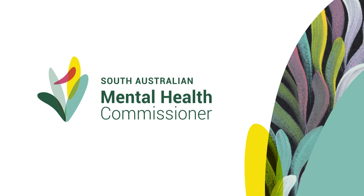
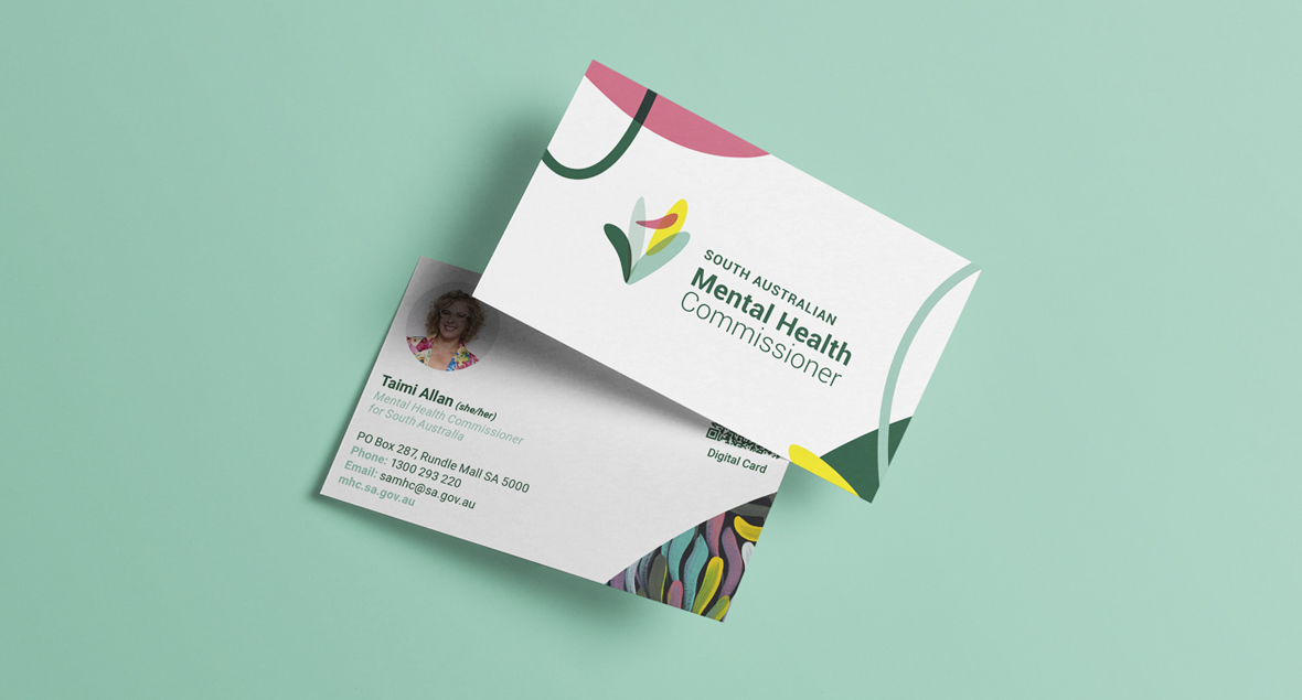
South Australian Mental Health Commissioner
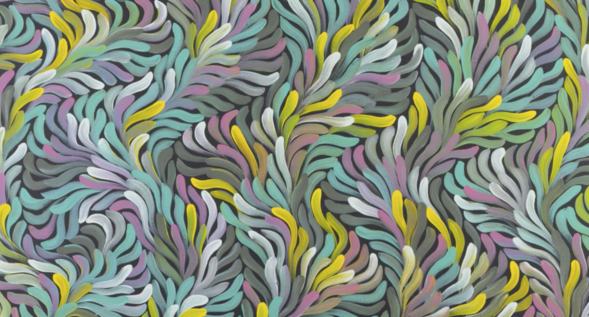
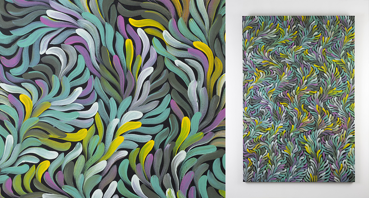
The new brand identity for the South Australian Mental Health Commissioner is inspired by the colourful, layered, flowing bush leaf, symbolising healing and strength. It embodies the Commissioner’s role in bridging gaps between government, community, and individuals for holistic mental health care in SA.
The South Australian Mental Health Commissioner’s new brand identity embodies a strategic vision of inclusivity, cultural respect, and holistic care. The logo design incorporates the flowing forms of bush leaves, inspired by the Indigenous artwork we commissioned from renowned artist Audrey Brumby (Pukatja | Pitjantjatjara), titled Tjunguringkula Palyantja meaning ‘Coming Together to Be Well Again’. This symbolism reflects healing, strength, and traditional wisdom. The logo’s layered design reflects the complexity and interconnection of mental health services across South Australia. The identity supports the Commissioner’s role in bridging gaps between government, community, and individuals, positioning the organisation as a trusted, inclusive, and forward-thinking leader in mental health for all South Australians.
Vision • Voice • Value
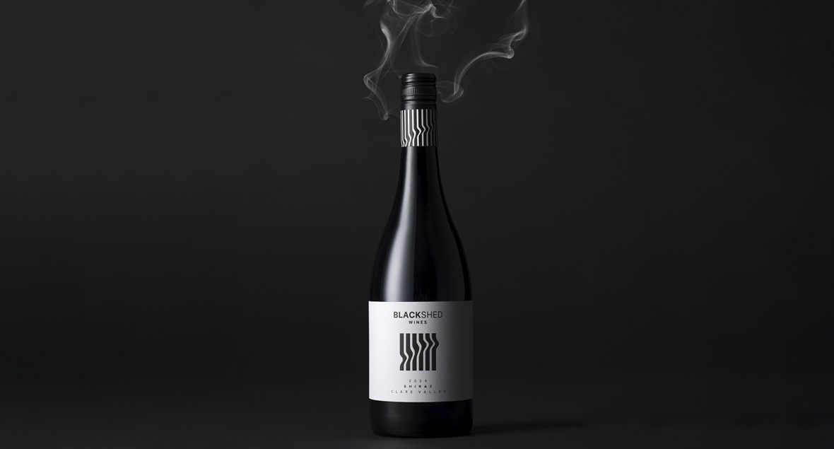
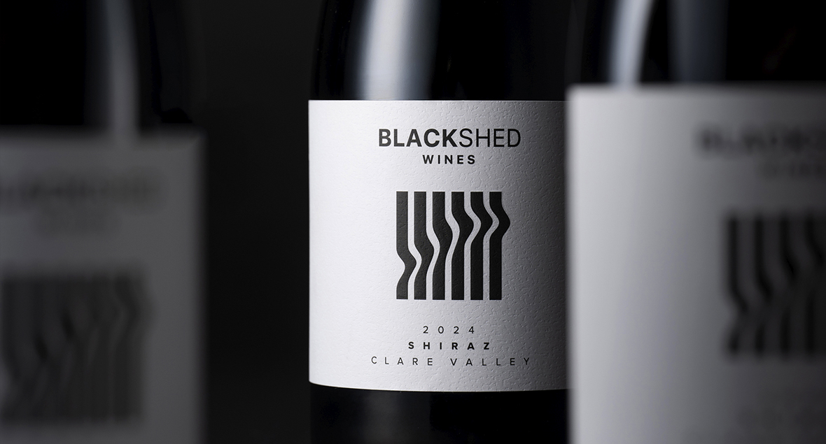
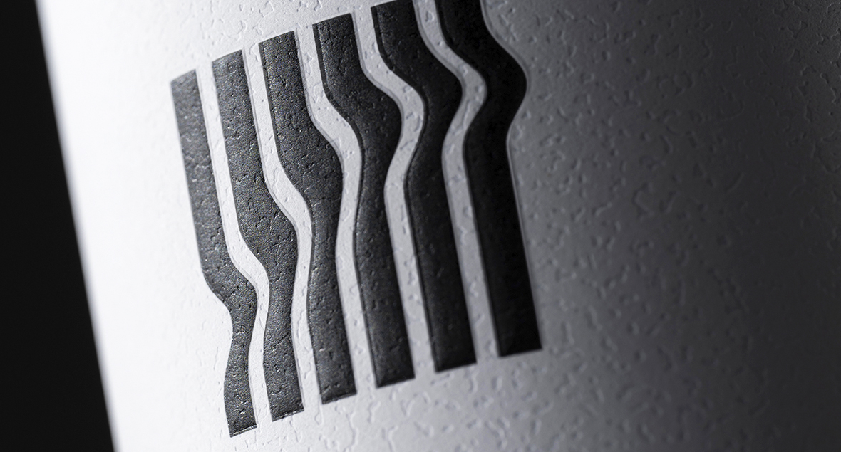
Black Shed Wines
“When a fire took our home and a lifetime of memories, we found strength in starting afresh.”
The wine reflects the family’s journey, rooted in resilience, forged through challenge, and crafted with care. From the ashes, Black Shed Wines was born. The label design is inspired by the story of the fire and the renewed life to rebuild. Smoke, burnt and twisted corrugated iron of the shed, and the black ash that remained.
Born from resilience, crafted with care.


Knappstein 1878 Transcendence
Transcending the expected to create something truly exceptional — Transcendence.
Knappstein’s brand mark features an abstract timeline running through the logo that bridges past, present, and future.
The bottle’s sophisticated design, luxurious packaging, and theme of timelessness help tell the story of Knappstein’s continuous journey of change. From its origins as a brewery in 1878, nestled in the heartland of the region, to what it is today – an iconic Clare Valley winery.
Harvesting heritage, Crafting excellence.


&Peabody Spirits
Turning every bottle into an unadulterated celebration of new experiences shared with &Peabody.
Meet &Peabody Spirits, previously known as Magpie Distilling. We redesigned the packaging and brand to better reflect the owners’ personality—emphasising quality, creativity, and fun, while embracing risks and quirky adventures. The three-wheeled bike logo mark symbolises the two owners’ creative minds combining into one quirky, unique third wheel – ‘You, me, and Peabody’. Thus, &Peabody was born. The tone of voice is wildly playful, with copy that is delightfully engaging and whimsy, creating a world where anything goes. The packaging embodies the brand’s spirit through bold, multi-coloured foils and a distinctive bottle shape, complete with lively, colour-coded topper seals. Unique illustrations were created for each product, reflecting the ingredients, flavours, and expressions of each variety, setting them apart in a market often characterised by minimalistic designs. Buckle up and join them on this thrilling ride!
“You, me, and Peabody”


Harcourts - Advertising Campaign
Whether upsizing, downsizing, or seeking a new perspective, they’ll be your unwavering support through life’s transitions.
Embrace transformation with Harcourts, your steadfast companion. The caring team combines expertise and compassion to lead you towards the best outcomes for your next move. Embrace change with confidence, knowing Harcourts is your trusted partner.
Change your view,
change your reality.