Branding
Black Squid Design is renowned for its branding and communications design, as well as generating ideas that break convention.
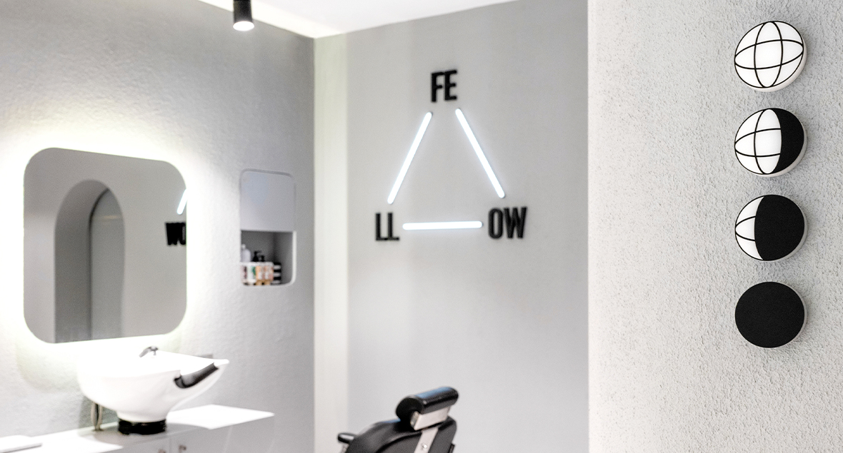


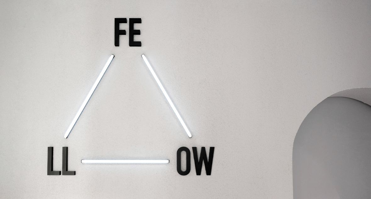
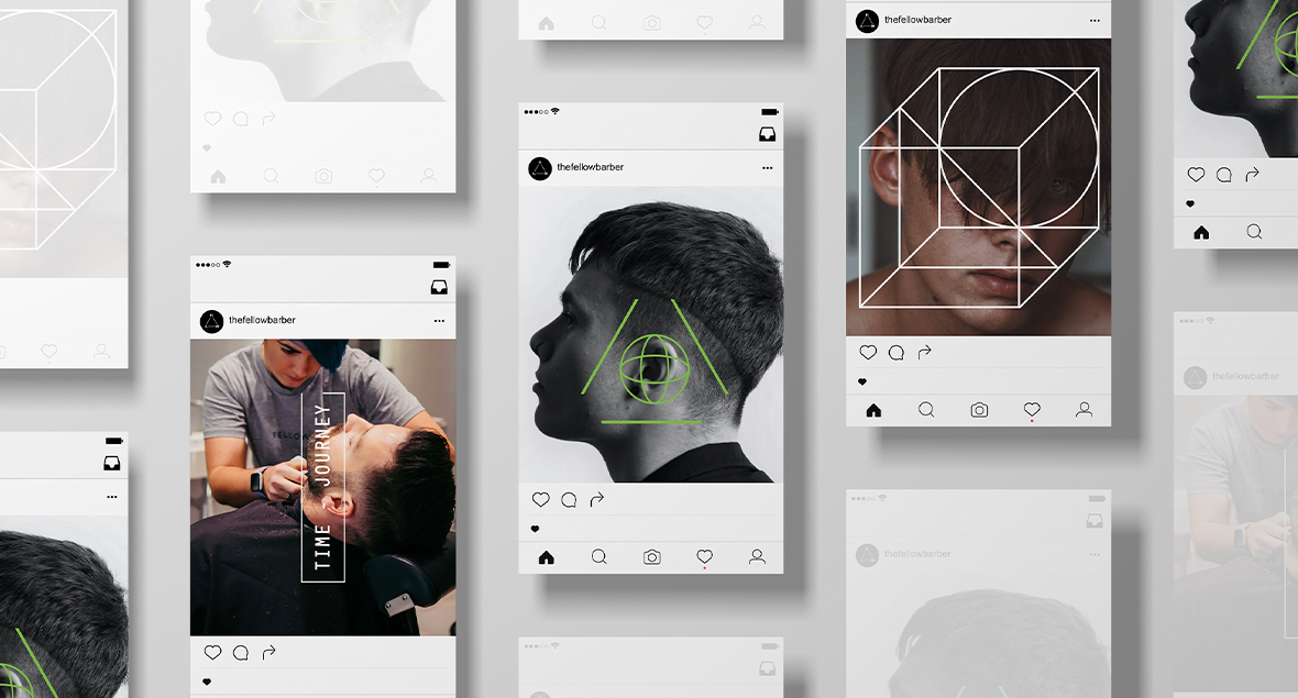

The Fellow Barber
The Fellow is about blending old school men’s styling with a fashion-forward attitude. Connection is at the forefront of a barber shop, which is expanded upon in the design brand identity, showing the connection of humans all being a part of a bigger picture.
The brand was created with the intention of showing the beauty and simplicity in the unexpected/ unexplored. Core graphics tell stories about discovery, method, mould breaking… a new future.
Logo, signage and brand identity for The Fellow Barber. An icon, minimal, unblemished, open to interpretation.
Creating the future you!


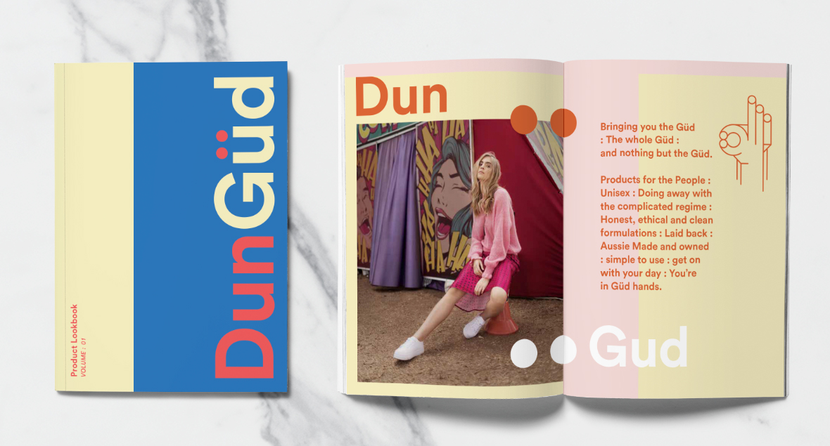
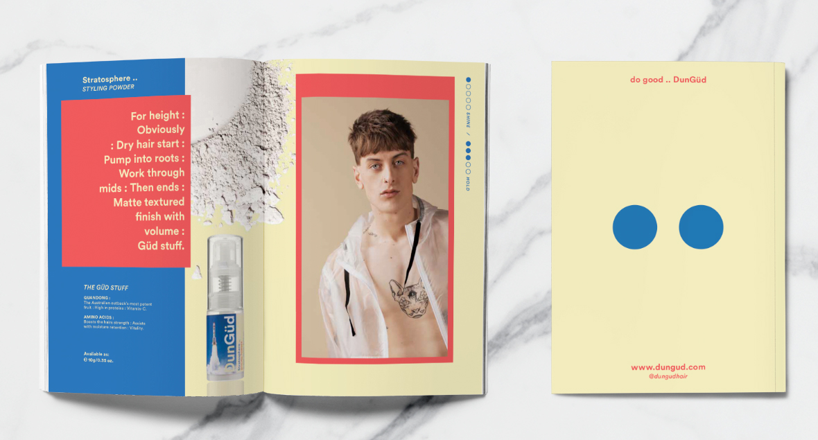

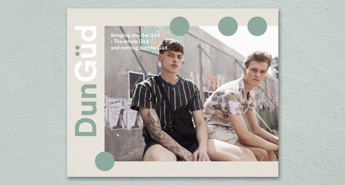
DunGud
Products for the People : Unisex : Doing away with the complicated regime : Honest, ethical and clean formulations : Laid back : Aussie Made and owned : Simple to use : Get on with your day : You’re in Güd hands.
Naming, Logo, packaging and brand identity for an Australian made haircare brand.
Bringing you the Güd : The whole Güd : and nothing but the Güd.


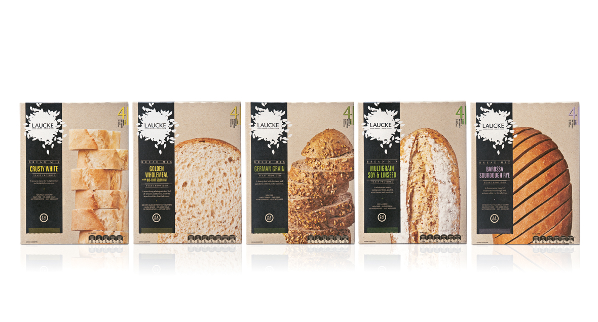

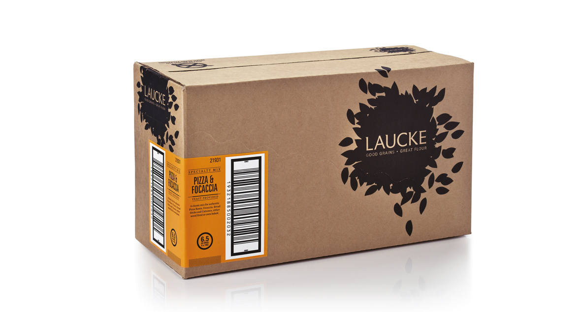
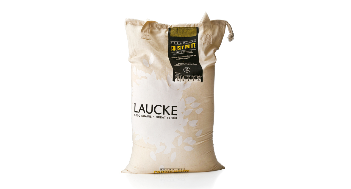


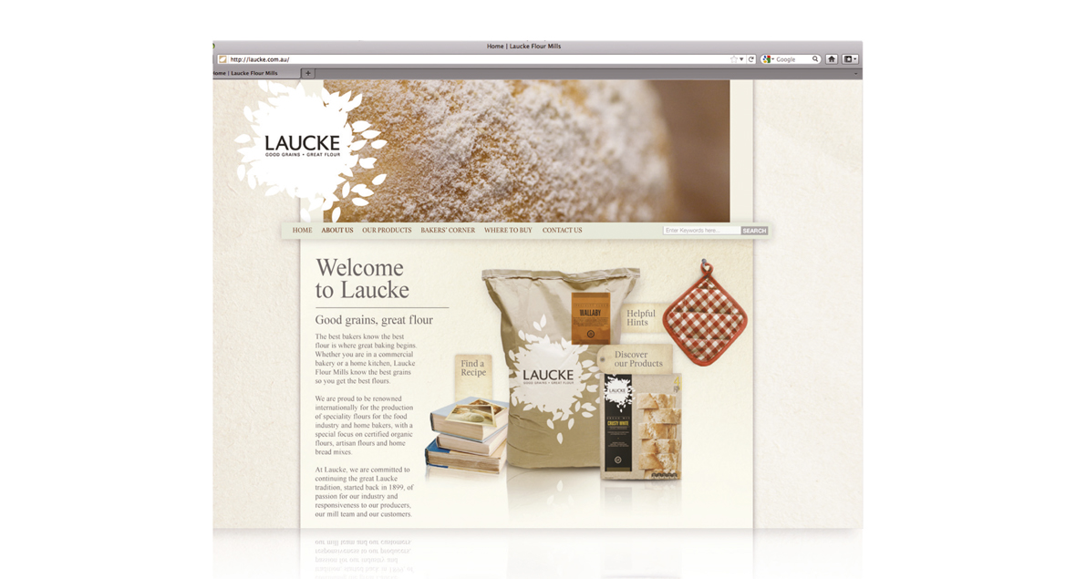

Laucke Flour
Laucke is rich in tradition with a strong history of supplying quality flour to professional and home bakers throughout Australia.
A refresh for the tired Laucke brand to a more contemporary brand and to target a niche market – the artisan baker.
A more uniform brand and revitalise all lines of professional and retail packaging to reflect the Laucke philosophy.
The logo reflects the fact Laucke start with the grain selection – not just flour.
The brand is strong, natural, contemporary, and flexible to adapt across all forms of communication, media, packaging variations and new product development.


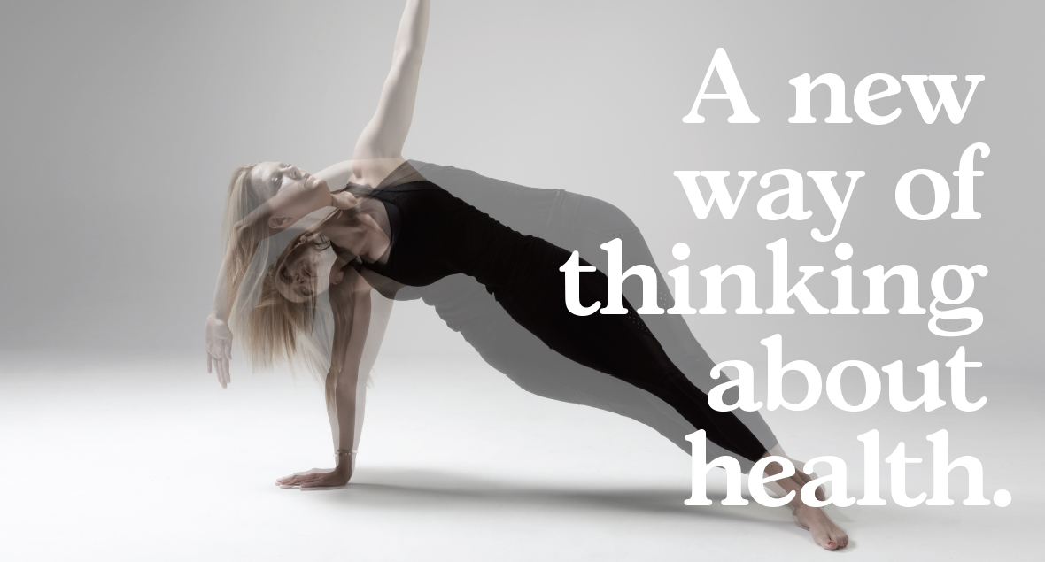
The Simple Everyday
The Simple Everyday is a pilates and wellness studio that believe movement, good nutrition and a relaxed mind are key ingredients to maintaining a youthful zest to everyday life.
Naming, logo, photography direction and brand identity for The Simple Everyday.
A new way of thinking about health.


&Peabody Spirits
&Peabody Spirits infused with a burst of personality.
We introduced an entirely new brand to better reflect the owners fun-loving and adventurous nature. The three-wheeled bike logo mark symbolises the two owners’ creative minds combining into one quirky, unique third wheel – ‘You, me, and Peabody’. Thus, &Peabody was born. We’ve infused the new brand identity with explosions of colour and flavour, featuring illustrations that frolic with the unexpected. The tone of voice is wildly playful, with copy that is delightfully engaging and whimsy, creating a world where anything goes.
You, me, and Peabody.

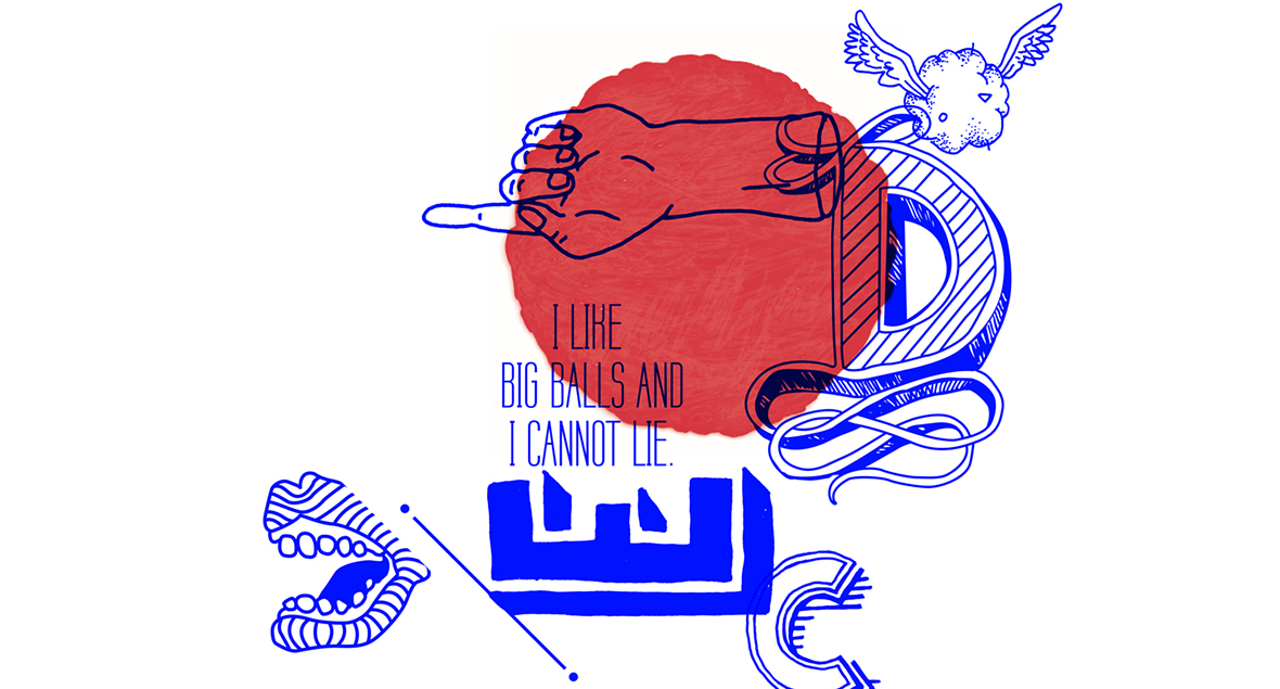
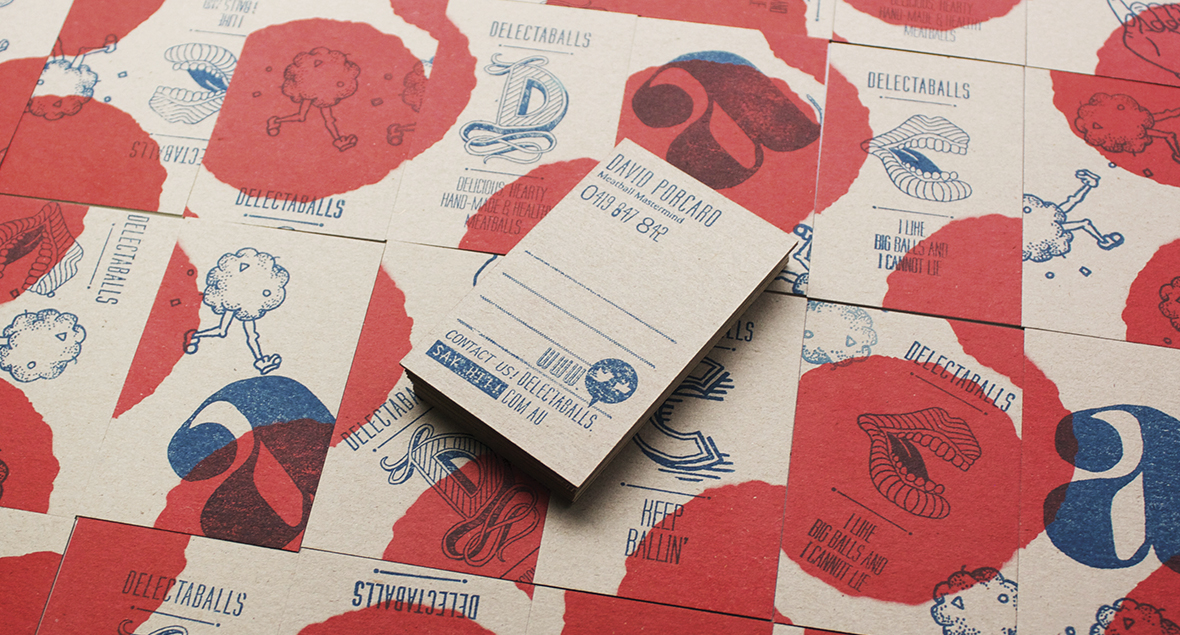
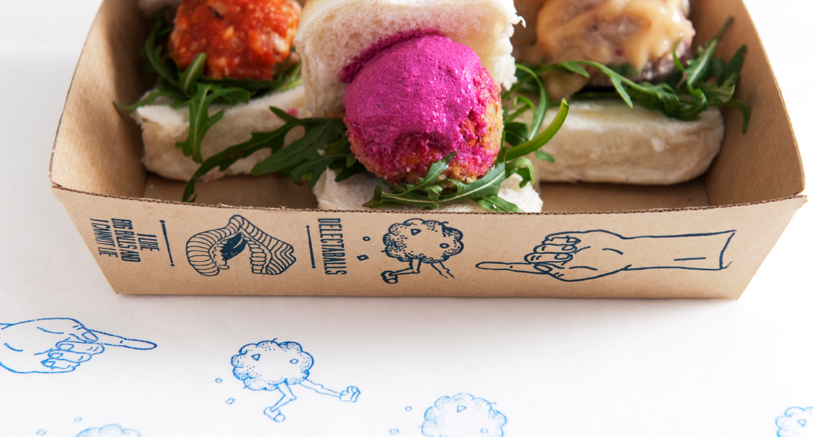
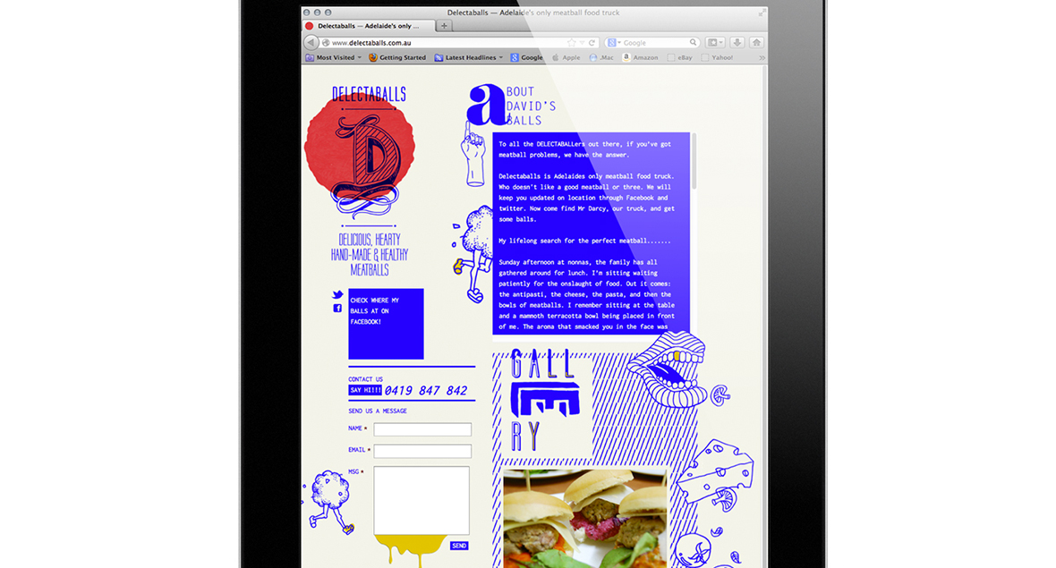
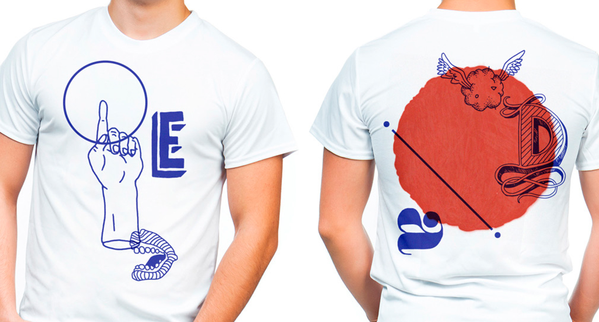
Delectaballs
Unabashedly fun, quirky and irreverent.
Delectaballs is a playful brand and application to the food truck. A fluid identity that reflects its delicious balls!
A food truck with BALLS! Literally!
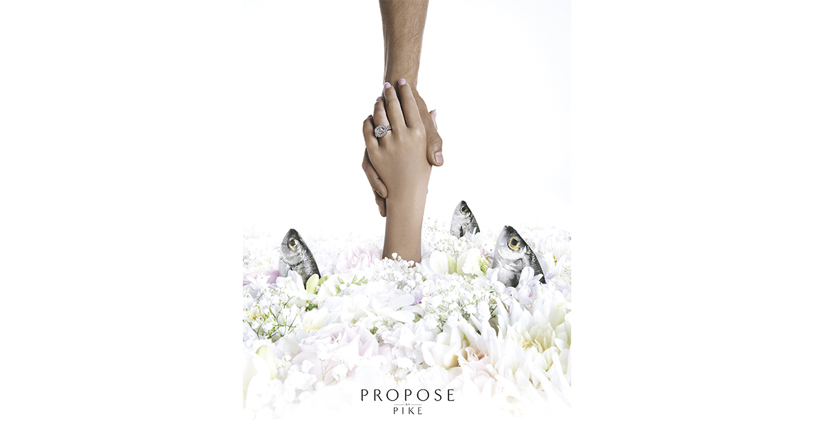


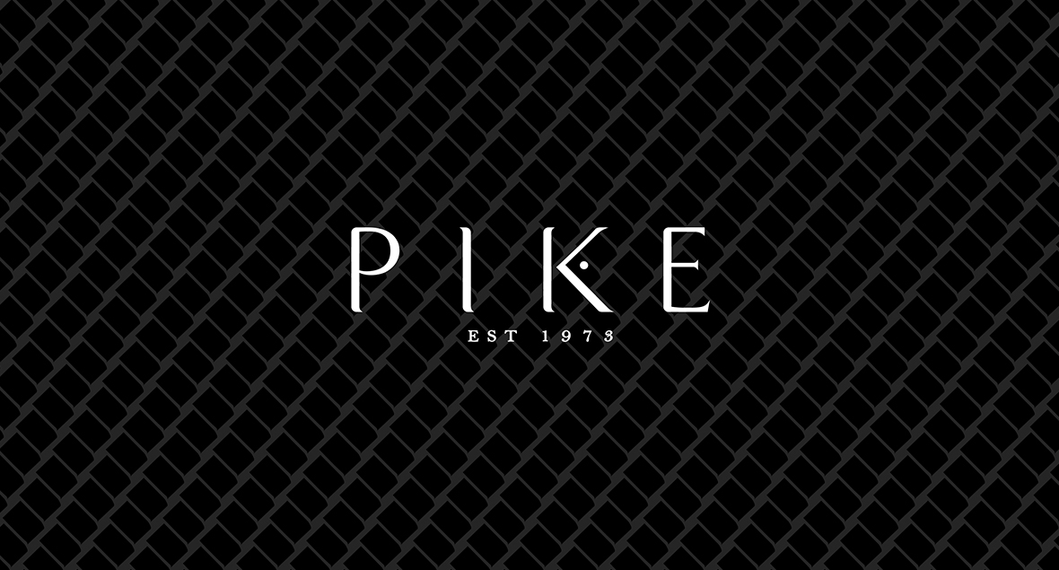
Pike Jewellery
Nicholas Pike has been designing exquisite jewellery for 40 years, and needed a brand refresh.
A new logo and a sophisticated campaign involving evocative imagery created for each range.
Timeless elegance, refined for a new era.
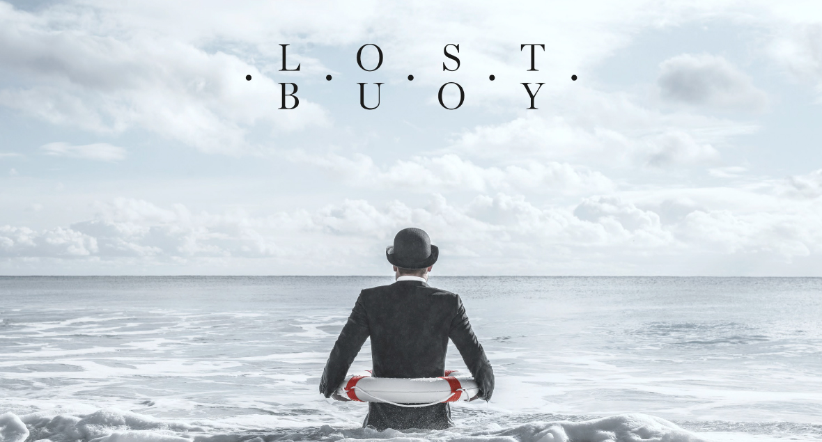

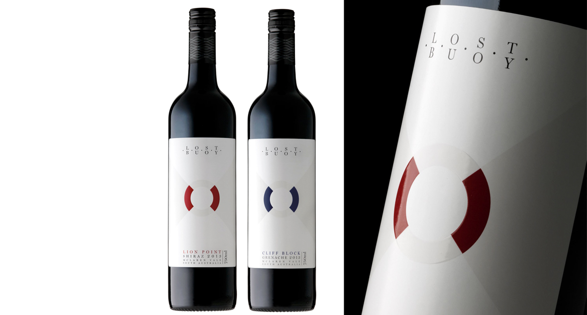

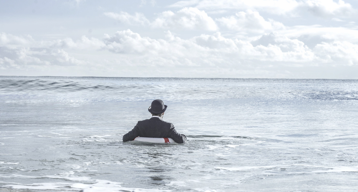
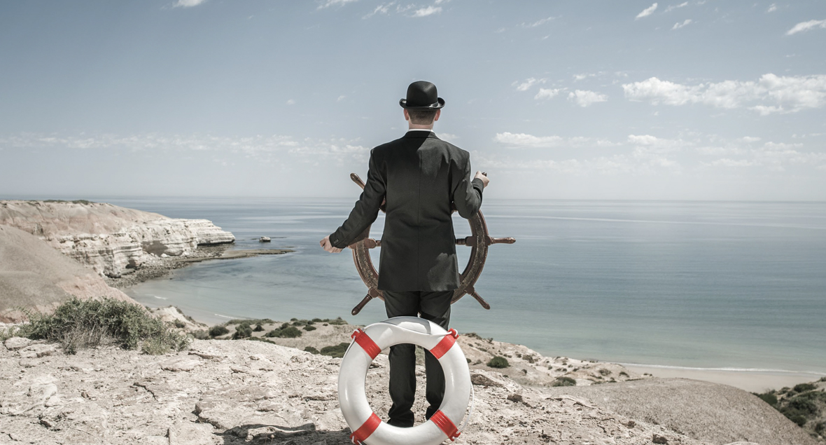
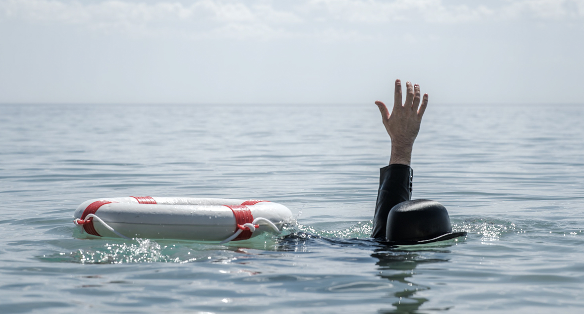
Lost Buoy Wines
A boutique winery on the coast of McLaren Vale. The closest vineyard to the sea in Australia, the Lost Buoy vines grow within 50 meters of the cliff edge, above the Great Southern Ocean.
Abandon Ship! The last words the buoy heard be fore he found himself ashore. A dreamer, a wanderer, a cast-away; the Lost Buoy has set sail. Between the wild winds and heady waves, anchored high a top the cliffs of the mysterious ocean, Lost Buoy Wines is born. Each variety has a different image and setting with the element of mystery or surrealism.
A brand with simplicity, mystery, intrigue and an element of quirkiness.


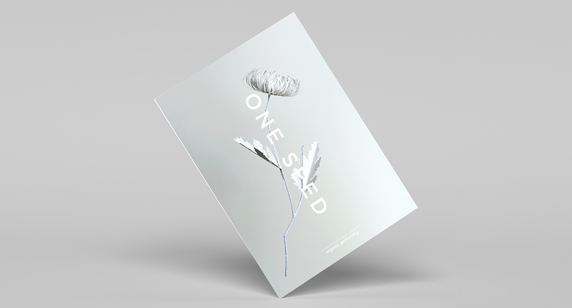

One Seed
A range of intricate paper cut flowers and plants, influenced by the ingredients used and fragrance of the perfumes of One Seed.
More than 20 individual plants were individually and meticulously hand crafted and composed in various sets to reflect various products and categories within the brand. The images were applied across web, social media and printed promotional materials.
Creating paper petals and leaves with natural plant stems and branches to create an amalgam of nature with an artisan approach.


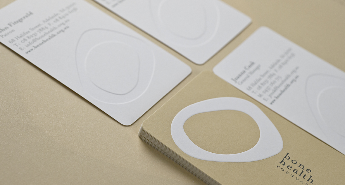

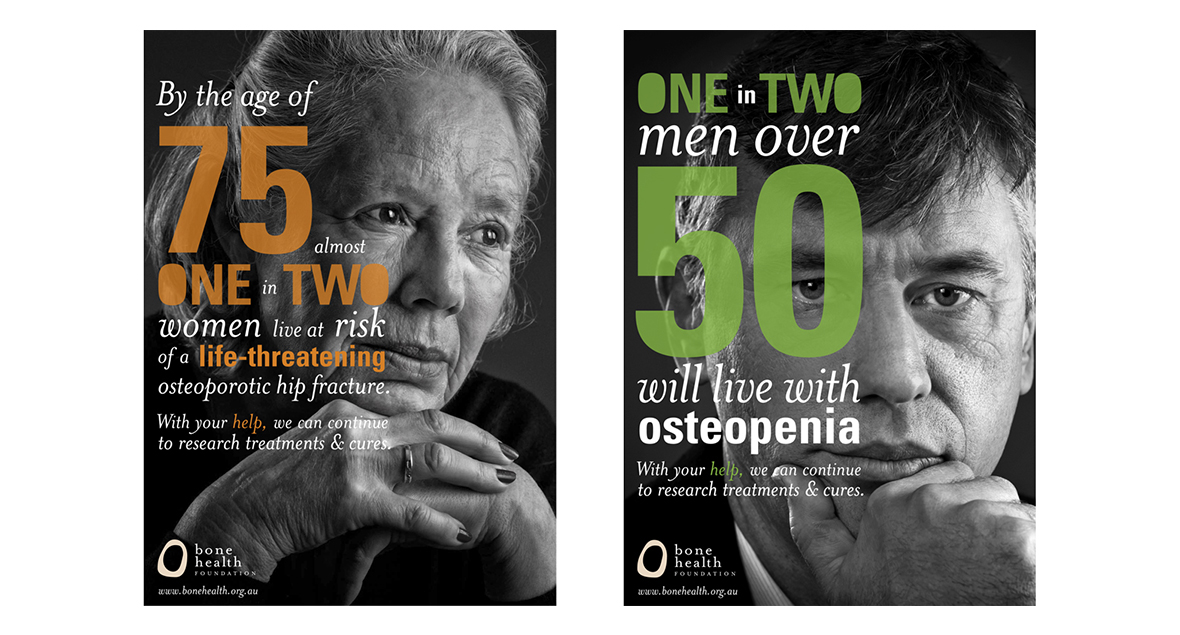

Bone Health Foundation
A corporate identity for an Australian not-for-profit organisation that raises money for education and research into bone health and musculoskeletal conditions.
Can you feel it in your bones?

Say Cheese Wholesale
A simplified bold logo which translated to a diecut business card to add a bit of the Say Cheese quirk.
Squeak Squeak!


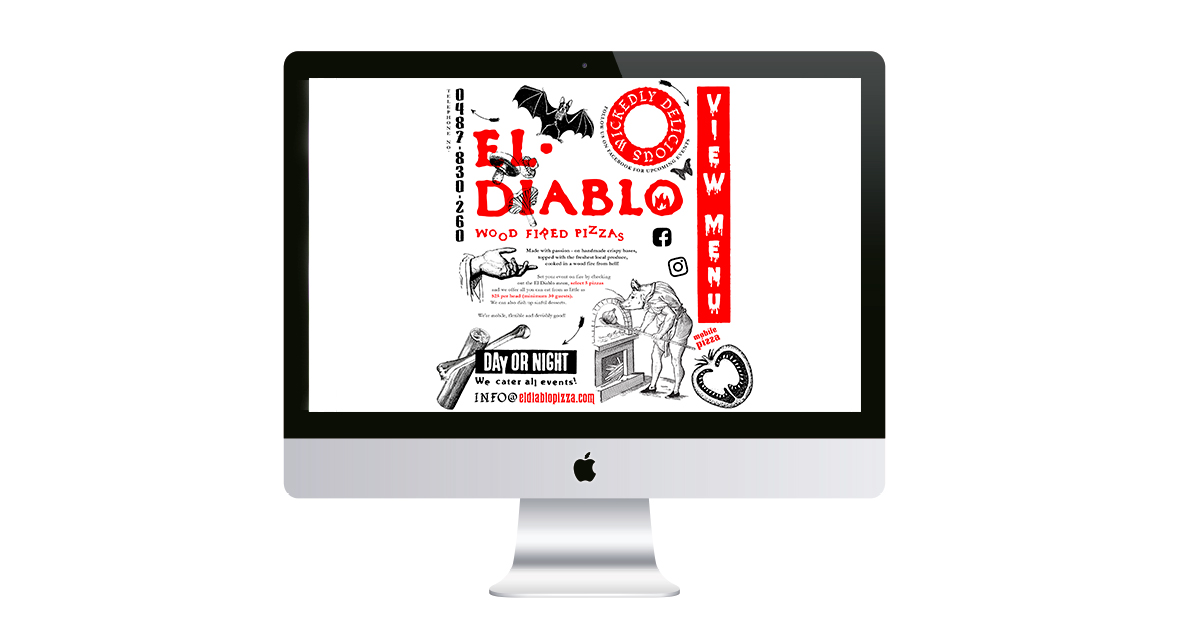
El Diablo Wood Fired Pizzas
Handmade dough, gourmet toppings and fresh local produce all cooked in a wood fire from hell!
El Diablo is a mobile wood oven pizza trailer, which utilises vintage illustrations combined with fun horror-like typography to suit the devilish theme.
Wickedly delicious.

Encounter Youth Schoolies
Poster design for Schoolies 2020. All of the poster elements were designed to be deconstructed and used individually for the social media advertising campaign leading up to the event.
School’s out for summer!