From The Deep
The official blog of Black Squid Design. Explore throwbacks, behind-the-scenes insights and deep dives into all things Squid.
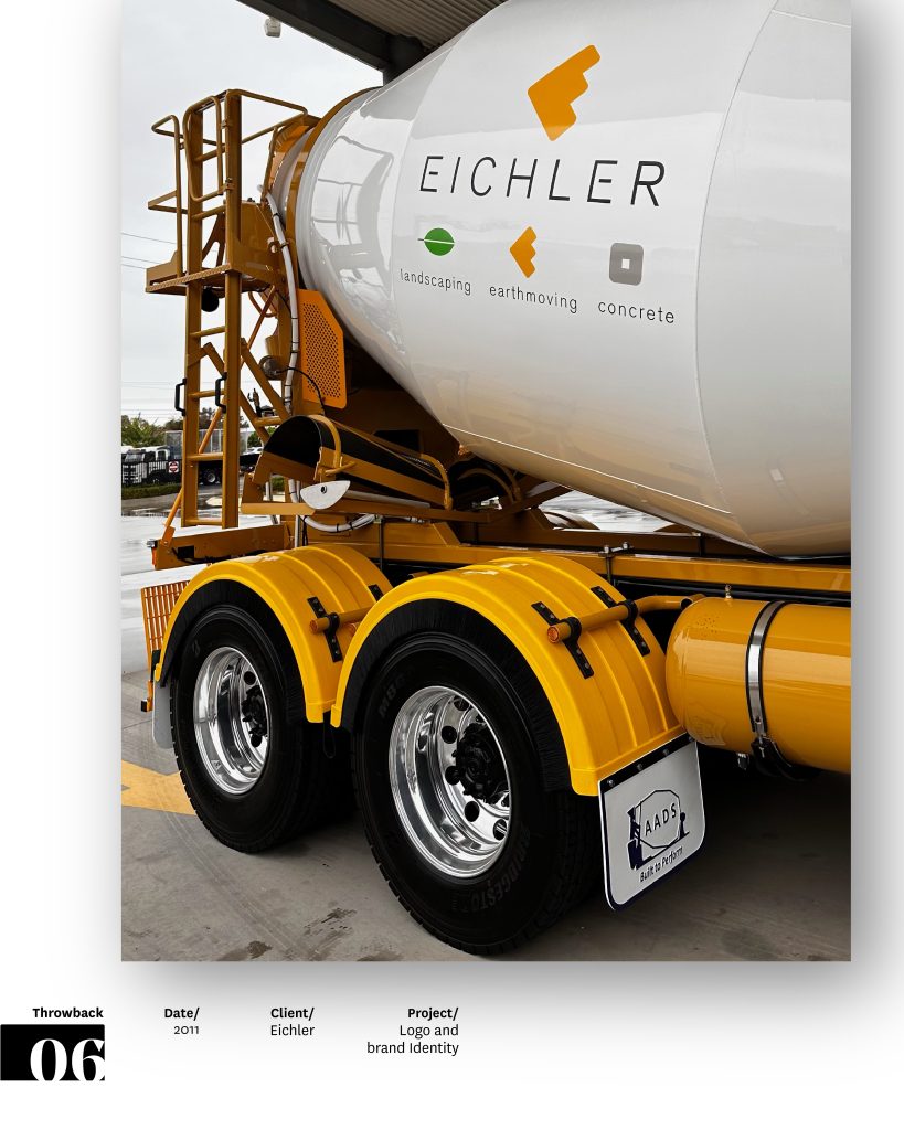
Eichler Earthmovers
Logo & Brand Identity
When Eichler approached us, the challenge was clear: their brand needed to communicate much more than earthmoving. While they are known for civil works, the Murraylands rely on them for landscaping supplies, concrete delivery, and building materials. Their brand needed to reflect this diverse offering while staying recognisable and professional.
Our solution was to create an overarching brand icon that anchors the identity, paired with two supporting icons that can be used independently or together. This system allows flexibility across services, marketing materials, and vehicle signage, while keeping the brand cohesive and instantly recognisable.
Eichler Earthmovers Pty Ltd is a family-owned business with over 50 years’ experience in South Australia. They pride themselves on quality, safety, and professionalism, values that were critical to communicate in the branding. Our design captures their versatility, reliability, and commitment to excellence.
The result is a brand system built to grow, supporting multiple service areas while clearly communicating the business’s strengths, values, and capabilities.
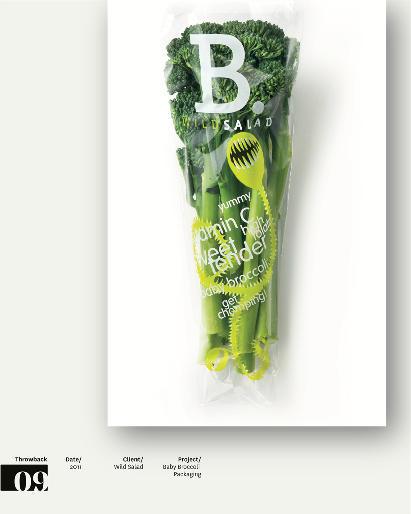
Wild Salad Baby Broccoli packaging
In a category where produce often feels like an afterthought, Wild Salad was shaking up the veg aisle with packaging that put freshness and visibility front and centre. Baby broccoli, normally bundled loose and handled by who-knows-how-many hands, was instead snap-chilled, sealed, and perfectly portioned in clear recyclable sleeves.
Back in 2011, our brief was to create a logo and packaging that could help the brand stand out in a sea of sameness. The clear sleeve became the hero, letting the product itself shine while keeping it protected.
What made this project different was how the pack itself became the advertising. Instead of silent bundles of greens, the sleeves spoke directly to shoppers with words like Vitamin C, sweet and tender, high in folate, get chomping, yummy. At the time, these kinds of product claims and playful cues were rarely seen in the fresh food section, but they gave Wild Salad an approachable personality while turning everyday broccoli into something with clear benefits and a bit of charm.
It was an example of packaging as storytelling: using visibility, voice, and personality to disrupt a category that had been left largely unbranded.
The project was an early nod to where fresh food packaging was headed: smaller formats, transparent materials, and design that treated produce with the same care as any premium product. Wild Salad may have been ahead of its time, but the ideas still feel relevant in today’s aisle.
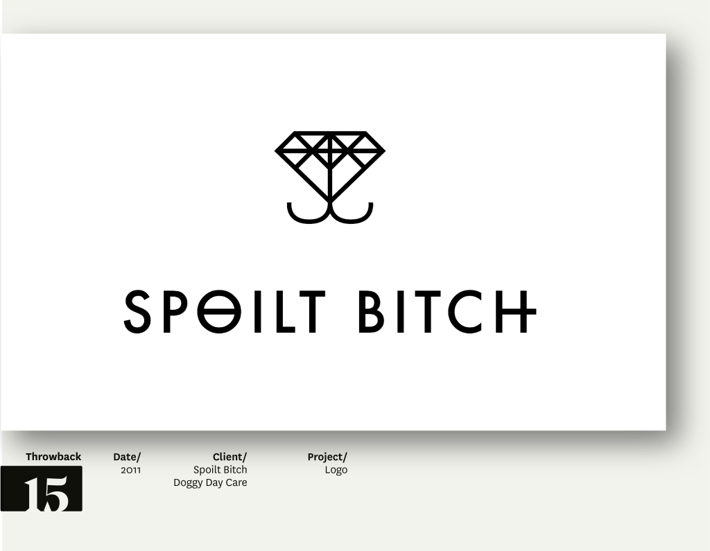
Spoilt Bitch Doggie Day Care
The brief was to develop a name and logo design for a boutique doggy day care centre located in the upmarket Sydney suburb of Potts Point.
The primary target market includes affluent dog owners and members of the LGBTQIA+ community, who treat their pets as beloved companions and family. These clients typically drop their dogs off once or twice a week for social play, scenic walks, and a little pampering — a day that feels like a luxury holiday.
We set out to create a name that was edgy, memorable, and relevant, paired with a logo that is bold, simple, and versatile — with the potential to extend across a high-end doggy lifestyle product range.
They say dogs are a man’s best friend.
And diamonds are a girl’s best friend.
What do you get when you put them together? A Spoilt Bitch.
The finest doggie day care in Potts Point.
Client testimonial
“… Admittedly I was initially a little hesitant about the name you presented to me but after further reflection I realised that the Spoilt Bitch is exactly the name I need to distinguish myself from my competition. Focus testing of the gay community further convinced me that the name coupled with the classy logo was both intuitive and progressive. Thank you for listening to me and absolutely nailing the brief. You greatly exceeded my expectations.”

Stop, Look, Read
Inform, educate, and promote harm minimisation and overdose prevention.
A series of posters designed for licensed premises, aimed at capturing the attention of both the general public and illicit drug users aged 17–35. Each poster focuses on a specific drug type and features a hand-crafted mask, uniquely painted in bright, expressive colours to reflect the drug’s associated behaviours or effects. The masks symbolise how drug users sometimes ‘mask’ their true selves from society and the transformative effects of drug use. To maximise visual impact, the masks were photographed against a stark white background, paired with bold black-and-white typography.
This campaign extended beyond posters and included folders, information sheets, stickers, and a quick-reference card outlining overdose response procedures.
The posters were printed on gloss-coated stock with an all-over matte varnish, leaving the mask and large headline text unvarnished to create a striking contrast and subtle three-dimensionality.
The masks themselves were hand-sculpted from found wood in nearby parks. Tools like grinders, axes, and drills were used to achieve their rough, raw aesthetic – then painted in vibrant colour palettes that resonated with the target demographic.
Through striking imagery and direct messaging, these posters tackle one of society’s most difficult issues. They compel young people to stop, look, read, make informed choices — and hopefully, in doing so, we’ve made some kind of difference.
Feedback
“The sector has been extremely responsive to this information, with licensee training providers now incorporating the content within their Responsible Service of Alcohol training programs, and the information being considered for incorporation into the Liquor Licensing Act’s Code of Conduct.”
Another one from our Throwback series in the Black Squid archives. We’re sharing favourite moments from 30 years of design — some iconic, some hidden gems, some never seen before — all proof that Design is for life.

ZAK
The brand with the tag – Zak Haircare packaging Design.
The brief was to create new logo, brand identity and packaging for a range of hair styling products under the brand Zak. While the primary target audience is males aged 18-40, the design needed to remain inclusive and not alienate other demographics.
The client is an Adelaide-based hairdresser launching a curated collection of high-quality styling waxes and gels, competitively priced – notably below key competitors such as American Crew, TIGI, BAIT, and PPS. The products will be selectively stocked in upmarket salons.
The core objective was to design a clean, modern, and corporate visual identity that communicates sophistication, exclusivity, and value for money. The packaging needed to stand out in salon environments while maintaining a minimalist aesthetic.
The final concept featured a charcoal grey container with a clear lid, with the brand printed in white to create subtle contrast and highlight the product within.
All containers used the same grey base, to create strong shelf presence, while each product was differentiated by a fluorescent tag in one of five colours. These tags extend from the lid seal and carry all product and regulatory information, eliminating the need for additional labelling.
The typography used across the tags maintains this brand essence with a clean and contemporary finish.
All five labels were printed simultaneously on a five-colour press in one pass to minimise costs.
Tags were printed on Yupo synthetic, a strong, durable material resistant to wear – ideal for the product’s small circumference. The tags were designed to emulate the soft curves of fabric tags, avoiding sharp folds and ensuring a refined finish.
Feedback
“Love it. When can we get it? They look cool.” – Chocolate Salon
Another one from our Throwback series in the Black Squid archives. We’re sharing favourite moments from 30 years of design — some iconic, some hidden gems, some never seen before — all proof that Design is for life.

BOB
Packaging Design for FMCG prepacked, vacuum-cooled cauliflowers.
The goal: to shift habitual purchasing from fresh-cut cauliflower to fresh-wrapped, longer-lasting options and to increase overall cauliflower sales.
We concluded the product needed to personally connect with consumers. But how do you do that with a simple cauliflower?
We took an ordinary vegetable and gave it personality through simple, fun packaging -keeping production costs low while delivering maximum impact.
The design features a series of four labels introducing Bob, Doris, Doug, and Shirl. Fresh-cut, vacuum-cooled cauliflowers pre-packaged for lasting freshness by South Australian company Hills Fresh. Aimed at busy lifestyles, each label includes a serving suggestion to make the humble cauli more approachable.
We came up with the idea of individualising the cauliflowers with traditional names that consumers may find familiar and comforting. Taking people back to the days of Grandma’s roast dinners and to get the kids to eat their vegies.
Using four different names encouraged the buyer to return next week and try a different name (same product – different serving suggestion).
In a busy greengrocer environment, where products often compete on price or freshness alone, capturing a customer’s attention is everything. By injecting humour and personality into the packaging, we created an instant connection—turning a basic vegetable into a conversation starter. This kind of emotional engagement breaks the usual shopping routine and invites customers to pause, smile, and consider the product in a new light. It’s a simple yet powerful way to build brand recognition, encourage trial, and create a more memorable shopping experience that stands out among a sea of sameness.
Hills Fresh has already noticed a significant increase in demand for wrapped cauliflower, and a decline in fresh-cut sales.
And about the bags – back then, yes, they didn’t make compostable plastic… but they make a great bag to put your muddy footy boots in after the game, or you can always knit yourself a plastic raincoat!
The creative approach and execution of the Cauliflower packaging was again recognised at the highest level within the industry – Honoured with the prestigious Adelaide Advertising and Design Club (AADC) Gold Chair Award for the second time, celebrating outstanding achievement in design and creative communication.
Over the past 30 years, Black Squid Design has had the privilege of creating a wide range of design work – some bold and disruptive, others refined and timeless. While trends come and go, we’re proud to say that many of these past projects still hold their own. They remain relevant, visually engaging, and creatively strong – even decades later.
We believe that great design doesn’t expire. It continues to communicate, connect, and capture attention. That’s why we’re launching a new series called Throwbacks. A chance to revisit and share some of our favourite projects from the archive. Some are well-remembered, others never made it into the spotlight, but all deserve to be seen and celebrated.
We’ll be posting these throwbacks from time to time as a tribute to enduring creativity. Thank you to all the clients who placed their trust in us over the years – you’ve allowed us to explore, take risks, and bring your brands to life in ways that still make us proud today.