Signage
Black Squid Design think of sign design as shaping a sense of place. Signage creates the built environment, complimenting the engineered environment. Black Squid Design have experience with different materials and technologies to integrate your brand into a real environment. Well designed signage creates an experience to remember.
Stateliner
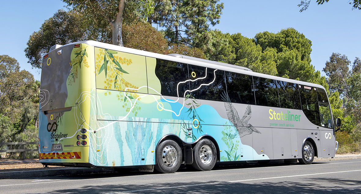
Stateliner has been operating passenger transport services in South Australia for over 45 years. Providing regular passenger and freight services to the Eyre Flinders and Mid North, South East and Riverland regions of South Australia.
The design uses layered photography, illustration and graphics representing the different regions.
The Hospital Research Foundation
Signage for corporate office for The Hospital Research Foundation in South Australia for better health and wellbeing for the community through life-changing medical research and improved healthcare.
The internal wall graphics were created to represent the all-encompassing components of the Foundation including: who they fund, the beneficiaries, their key priorities and the areas of support – cancer, heart disease, stroke, dementia and many others.
The interconnecting line graphics showcase how the Hospital Research Foundation work together to fund life changing medical research.
100 Miles - Kitchen and bar
South Australia produces world class food and wine – all within a 100 mile radius of Adelaide airport.
We wanted the brand to showcase the fact we can source the freshest local ingredients all from within a 100 mile radius.
The 10m wall graphics on the kitchen splashback references an aerial view of South Australia and the topographical contour lines of the land. An amalgamation of different mediums including acrylic, pastels, ink and charcoal. The vibrant colours and textures reflect the of ever-changing South Australian landscape.
Ingredients less travelled.
Australian Broadcasting Corporation
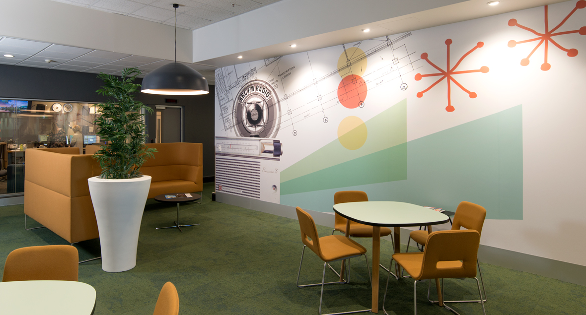
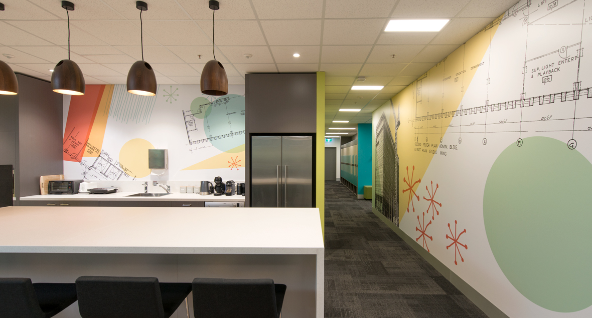
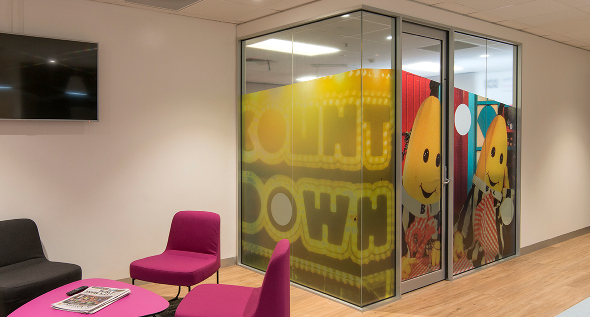
Interior signage for ABC corporate office.
Combining historical images with elements from the refreshed interior design to create interesting graphics throughout.
Public
Public is a cafe situated within the heart of Adelaide.
The logo and branding reflected the quality by using the golden ration in its formulation. An understated and modern black and white palette has been applied across all branding elements.
It was envisaged to be the ‘perfect meeting place’ for friends and family.
Harcourts - Advertising Campaign
Whether upsizing, downsizing, or seeking a new perspective, they’ll be your unwavering support through life’s transitions.
Embrace transformation with Harcourts, your steadfast companion. The caring team combines expertise and compassion to lead you towards the best outcomes for your next move. Embrace change with confidence, knowing Harcourts is your trusted partner.
Change your view, change your reality.
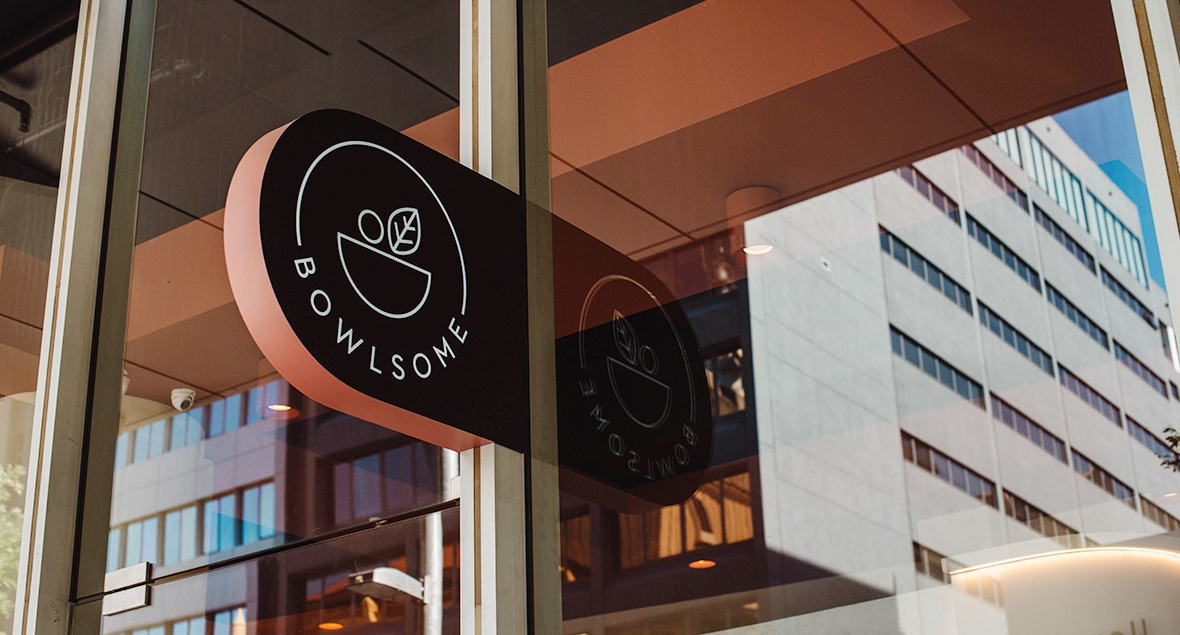
Bowlsome
Fresh, wholesome, locally grown food that’s full of flavour.
Seriously good bowls!
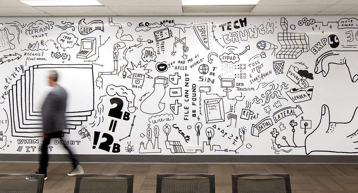
Comunet
Internal wall graphics designed to engage with the staff using IT focussed quirky illustrations.
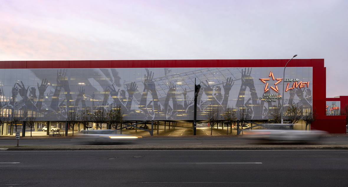
Adelaide Entertainment Centre Carpark
The Adelaide Entertainment Centre features an impressive façade treatment, transforming the carpark into a vibrant landmark.
Entire walls are clad in perforated metal panels designed to allow ventilation while showcasing dynamic live-music imagery. Each elevation presents a different performance scene, turning a utilitarian structure into a bold visual celebration of entertainment. Varying perforation sizes create a halftone effect in a single colour, delivering both functional airflow and a striking, contemporary space.
Seymour College
The vertical exterior sign continues on the underside of the entry as a 3 dimensional, brushed stainless steel typography feature that leads you into the building foyer.
The interior signage, featuring brushed aluminium fixed to orange Perspex, was designed to hang from bulkheads and wrap around corners to compliment the building structure whilst still maintaining clear a wayfinding system.
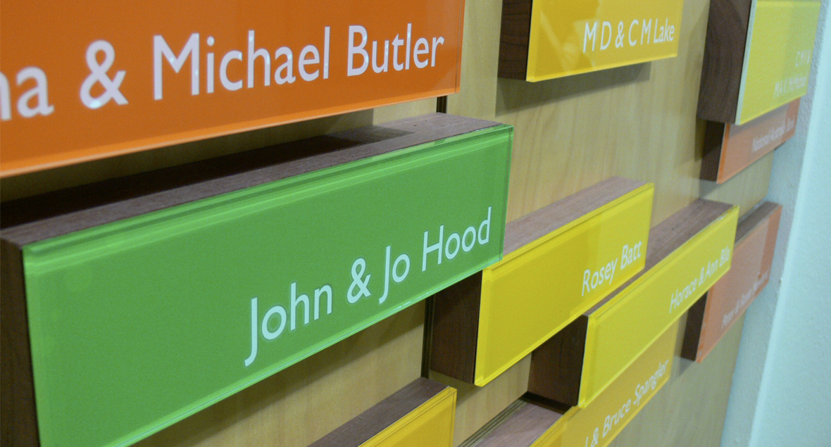
As the Centre for Performing Arts was constructed with major funds coming from donors, recognition of this was incorporated into the signage system through room naming and a feature donor board in the foyer.
Designed specifically to work in harmony with the building architecture.
Zak - Grooming For Men
After successfully releasing a range of men’s hair care products, Zak launched their first concept salon.
Referencing the tag system used in the packaging to differentiate the hair care range, the exterior, interior and a wall feature signage was created to build upon this unique identity.
Laucke
Making a statement and reinforcing the brand message on vehicle graphics.
Good grains, great flour.
Adelaide Entertainment Centre Lounges
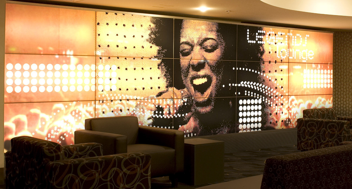
Internal corporate lounge signage at the Adelaide Entertainment Centre to create a vibrant, welcoming atmosphere for guests.
PrimeQ
Internal signage for Prime Q corporate offices.


