Food & Hospitality
Black Squid Design elevates food and hospitality, by crafting unforgettable experiences through brand and packaging that blends creative storytelling with purposeful design that keeps people coming back (for second helpings).
LUMA
Luma bar & restaurant marries the culinary ethos of European simplicity with a sophisticated yet casual elegance.
The brand is Art Nouveau inspired with a contemporary approach whilst displaying affordable luxury within the Adelaide CBD. The Restaurant is distinguished by bespoke culinary concepts and attention to detail with nods to the french heritage which can be seen throughout the brand.
Delight your senses.
Aye Frank
Very fun, very fresh, very Frank.
New logo and brand identity for Aye Frank.
Best Coffee + Panini in the West (and a recording studio too).
Coffee. Panini. Recording.
BAHA
A vibrant fusion of Coastal Miami, Latin American, and Caribbean influences.
New logo and brand identity for BAHA Poolside Bar & Kitchen in Perth, WA. Our brand reflects the eclectic atmosphere of BAHA Bar, with bold colours and eye-catching illustrations that capture the essence of the coastal-inspired cuisine and lively ambiance.
The havana heartbeat!
Public
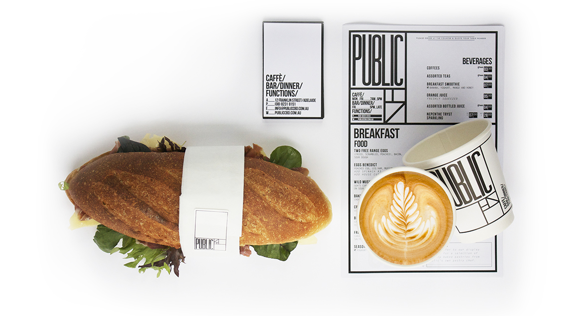
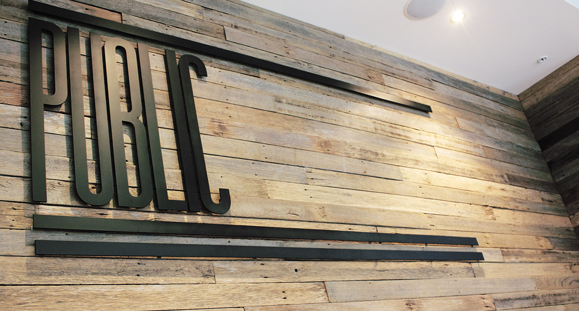
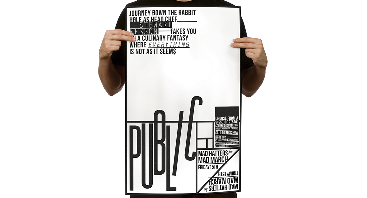
Public is a vibrant café nestled in the heart of Adelaide.
The logo and branding uses the golden ratio in its formulation. An understated and modern black and white palette has been applied across all branding elements.
It was envisaged to be the ‘perfect meeting place’ for friends and family.
100 Miles - Kitchen and bar
South Australia produces world class food and wine – all within a 100 mile radius of Adelaide airport.
A bold logo was designed to showcase the essence of local authenticity, emphasising the commitment to fresh, regionally-sourced produce within a 100 mile radius.
The 10m wall graphics on the kitchen splash-back references an aerial view of South Australia and the topographical contour lines of the land. An amalgamation of different mediums including acrylic, pastels, ink and charcoal. The vibrant colours and textures reflect the of ever-changing South Australian landscape.
Ingredients less travelled.
ARGO
A family run business built on trust, passion and love.
Argo’s brand refresh features their iconic Argo orange — bright and bold, just like their exceptional service.
The new logo and design capture the vibrant energy that has made Argo a local favourite.
The family’s vision is very clear: to make healthy food accessible and delicious. Their business is their home and they want everyone to feel welcome when they enter.
Food for the people.
Blame Jason Café
A café always mistaken, for Jason.
A brand identity with heaps of personality — illustrations on the walls, and crumbs of ideas hidden beneath the cushions.
Point the finger, pass the buck,
he did this with tremendous luck,
shift the blame, spill the beans,
always hidden behind-the-scenes.
Coffee, cakes & sneaky tea breaks.
Easy By Fatsos
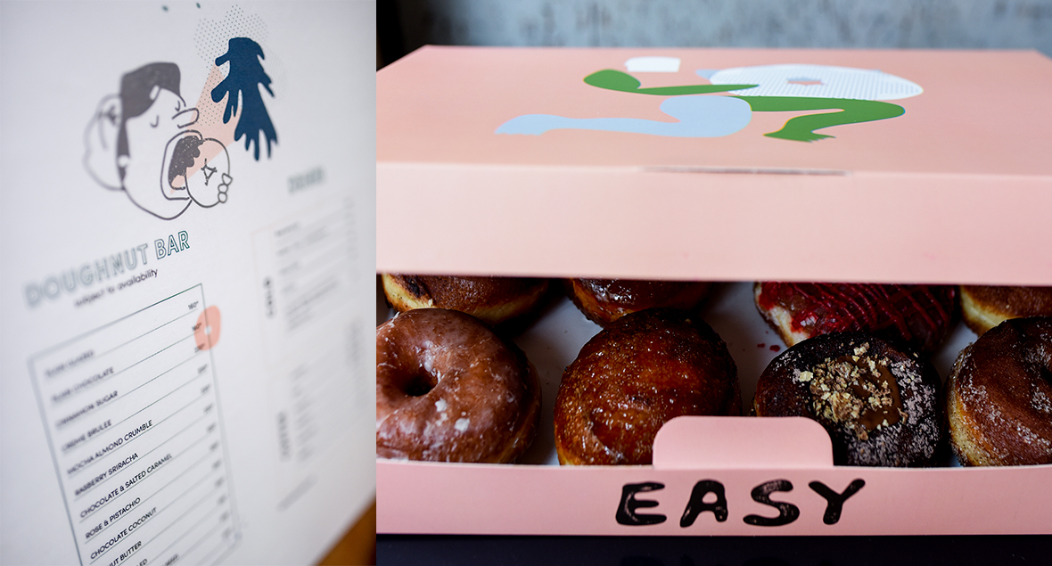
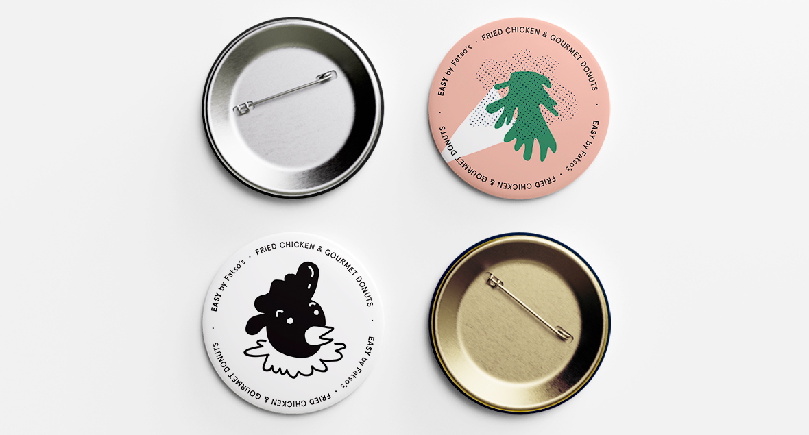
A restaurant in Karachi, Pakistan, offering a variety of delicious donuts and, dare I say, fried chicken burgers.
The quirky illustrations adorn the building, menu, packaging and merchandise, to create a memorable customer experience.
A delicious mix of donuts, fried chicken and quirky illustrations.
A·LE·RE
Alere Restaurant, a relaxed space for all-day dining,
doubling as a stylish venue for modern functions.
Blending gritty, hands-on photography with sleek, minimalist design and soft pastel brand colours incorporated into menus, business cards and print collateral, offering a modern dining experience that highlights fresh, local produce.
To be nourished.


